
CARE PLUS
How to create a product for people get medicine in time?
PROBLEM
There are significant differences in the medical systems of the United States and China. Many international students and local residents often struggle to understand how to navigate the process of visiting a doctor or obtaining medication while utilizing their insurance. Concerns about high costs and the time commitment involved frequently lead to missed opportunities for timely medical care and treatment.
GOAL
This project seeks to address these challenges by offering a mobile app designed for convenience. The app will provide clear guidance on understand insurance benefits, and obtain the necessary medications, and schedule appointment with expertises.
Time Frame: 1.5 month
Research Methodologies Used
-JTBD Interview
-Usability Test
-Mental Modes
-User Journey
RESEARCH

Far Distance from dormitory
In a Chinese community, there are at least two pharmacies, and the average distance for residents to reach a pharmacy is less than 1 mile.
In San Francisco, the nearest CVS pharmacy to CCA student dormitories requires a walking journey of 25 minutes. (most students don’t have cars)
Different Medical Practices
In China, there are 4,816+pharmacy stores working for 24 hours.
In United States, most medicines were placed in large pharmacy center. Most of them closed after 8:00 p.m.

PERSONA


“How do students generally feel about medical care on campus?”
“ I often feel confused about the medical care available on campus. It can be overwhelming, especially for those who come from different places with varying healthcare systems. “
“Have you noticed any common challenges students face regarding accessing medicines?”
“Absolutely, a common issue is that students are often too busy with their academic and extracurricular commitments. With a hectic schedule, it's easy to forget to go to the pharmacy to buy medicine, even if they have a prescription.”
HARDWARE IDEATION


SYSTEM MODEL
A visual representation of the steps a user takes when interacting with my vending machine is important to understand user behavior—Hence, I use a 6 steps user journey map in my design identify areas for improvement, and ensure the overall interaction is smooth, intuitive, and satisfying.


I also use the system model it to clarify the internal workings of the machine, making sure each part supports the user journey effectively. It includes the logic flow, processes, and interactions between system components, such as the payment module, item dispenser, and inventory tracker.


The Architecture Information gives a technical breakdown of the vending machine, covering both hardware and software elements. It shows how components are connected and how data flows through the system.
LOW_FIDELITY and UTILITY TEST
For the low-fidelity stage of the project, I created the detailed paper prototype and comprehensive wireframe specifically designed for user testing.

BRANDING & STYLE GUIDE

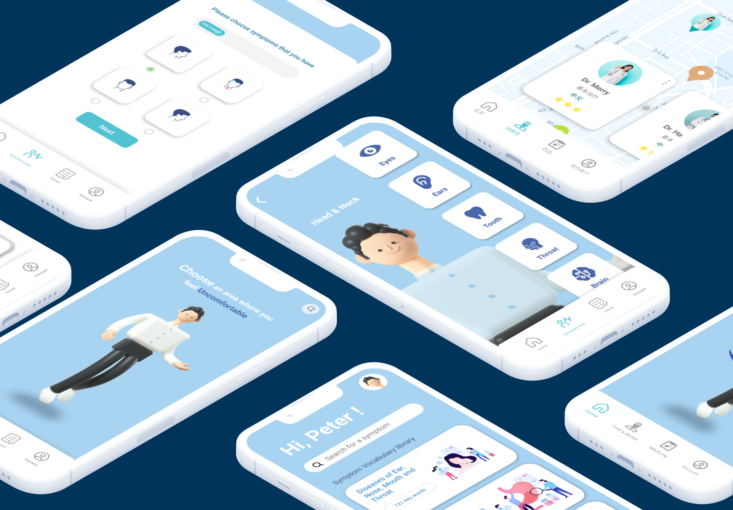
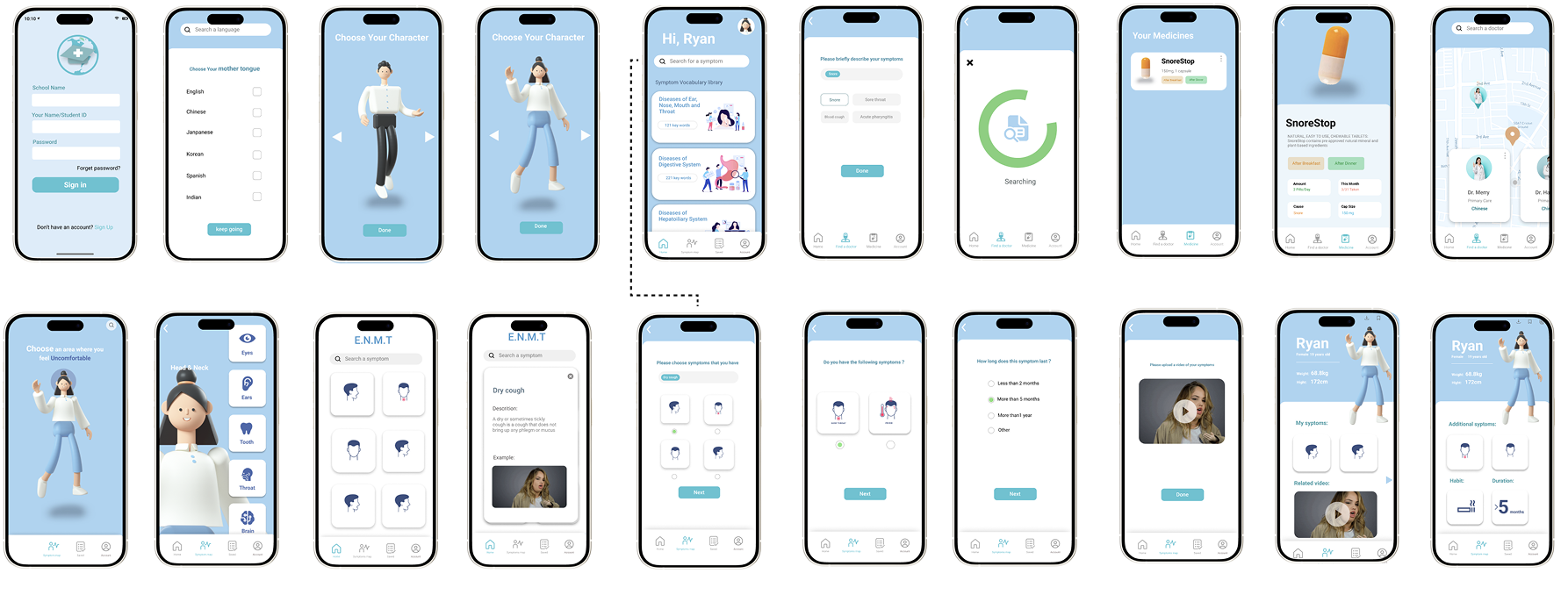
CARE PLUS-MOBILE
HI-FIDELITY PROTOTYPE
AFTER WORK IMPACT

Of our research participants returned to complete the high-fidelity prototype user testing and gave positive feedback. They found the app easy and clear to use. It effectively guided them through self-reporting symptoms, accessing timely medical assistance, and easily making appointments with specialists all with the assurance of insurance coverage.